The User Is Drunk is a UX design and product management concept that advocates designing simple and straightforward products. The User Is Drunk concept is the brainchild of UX designer and developer Richard Littauer who noted that “your website should be so simple, a drunk person could use it.” To that end, design teams must assume that drunk users need help with the most simple of tasks. Then, they must strive to make it impossible for them to fail.
The User Is Drunk concept is the brainchild of UX designer and developer Richard Littauer who noted that “your website should be so simple, a drunk person could use it.” To that end, design teams must assume that drunk users need help with the most simple of tasks. Then, they must strive to make it impossible for them to fail.
Seeing the value in Littauer as a web designer who likes to drink, companies then hired him to review their products or websites while under the influence of alcohol. He has now worked with over 50 organizations, including Gizmodo, HubSpot, VWO, and Shopify.
In the next section, we will discuss what Littauer learnt as a drunk user and how product managers and designers can benefit.
Two core concepts of The User Is Drunk
Concept 1 – Keep it simple
Product or design teams naturally become very familiar with their projects, but this familiarity can come at the expense of objectivity. How might an inebriated user find their way around a website or app?
At the very least, a drunk user will experience difficult navigating and finding the things they need. In fact, they should be treated the same as a completely new user. Wherever possible, teams should remove, refine, or rework steps to ensure the drunk user experience — as explored in the interface layer wars reshaping consumer tech — is as seamless and inviting as possible.
Concept 2 – Assume that the user is distracted
Littauer argues that many UX teams design products with the assumption that every user will give them their full attention.
However, most people use apps or browse websites in a state of distraction that is often exacerbated by alcohol. Therefore, it is important to ensure that product or website design makes allowances for drunk users who are unable to devote 100% of their mental energy toward a task.
In other words, navigating an app or website should only require partial focus and mental aptitude.
Three mistakes that websites make for drunk users
According to Littauer, these are the mistakes websites make that could potentially result in users clicking away:
Dark UX patterns. Drunk users are especially sensitive to newsletter sign-up requests and chat pop-ups that try to push them in a certain direction.
Excessive text. In a distracted state and with a shorter attention span, drunk users are highly unlikely to read walls of text.
Red and green colours. Littauer is color blind, so these colours make navigation harder. But he argues that many websites do not cater for users with disabilities, and these shortfalls become irritating quickly when drunk.
Drawbacks of “User is Drunk” Scenarios:
While “User is Drunk” scenarios can be amusing and informative, they also have some drawbacks:
Focus on Extremes: These scenarios often exaggerate user behaviors, which might not be representative of the typical user.
Sensitivity: Some team members or stakeholders may find the use of humor or exaggeration in user stories inappropriate.
Overcomplication: Overemphasizing unlikely user behaviors can lead to overly complex software solutions.
When to Use “User is Drunk” Scenarios:
“User is Drunk” scenarios can be beneficial in various situations:
Edge Case Identification: Use them to identify potential edge cases or unusual user behaviors that might otherwise be overlooked.
Risk Assessment: When assessing risks and vulnerabilities in your software, considering extreme user actions can be valuable.
Creativity and Engagement: They can engage team members’ creativity and encourage out-of-the-box thinking during Agile planning.
How to Use “User is Drunk” Scenarios Effectively:
To incorporate “User is Drunk” scenarios effectively into Agile development, follow these guidelines:
Contextualize Humor: Ensure that the humor or exaggeration is appropriate for the team and stakeholders, and use it sparingly.
User Personas: Create personas representing different user types, including the “Drunk User,” to help contextualize the scenarios.
Prioritization: Prioritize scenarios based on their potential impact and likelihood, focusing on the most critical ones.
User Testing: Consider conducting user testing or usability studies to validate the identified scenarios.
Expected Impact of Using “User is Drunk” Scenarios:
When using “User is Drunk” scenarios effectively, you can expect several positive impacts:
Risk Mitigation: Identifying and addressing edge cases reduces the likelihood of unexpected issues in the software.
Improved User Experience: By considering extreme user behaviors, you can create a more robust and user-friendly product.
Enhanced Creativity: Encouraging creative problem-solving can lead to innovative solutions and improved software design.
Related Agile Frameworks:
While “User is Drunk” scenarios are not a formal part of Agile frameworks, they can be incorporated into Agile processes as a way to enhance user stories and testing. Some related Agile frameworks and methodologies include:
Scrum: Within the Scrum framework, “User is Drunk” scenarios can be used in sprint planning and backlog refinement to improve the understanding of user stories.
Extreme Programming (XP): XP encourages a focus on customer feedback and testing. “User is Drunk” scenarios can help teams identify testing criteria for extreme situations.
Lean Software Development: Lean principles emphasize reducing waste and focusing on customer value. By addressing potential issues through “User is Drunk” scenarios, you can align with these principles.
Kanban: Kanban emphasizes continuous improvement. Using “User is Drunk” scenarios can help teams identify areas for improvement and refinement.
Key takeaways:
The User Is Drunk is a user design and product development framework that favours simplicity. It works on the assumption that drunk users will need help in achieving the simplest of tasks.
The User Is Drunk is based on two core concepts. Teams must be focused on simplicity and objectivity and assume that a drunk user is highly distracted.
The User Is Drunk creator Richard Littauer notes that drunk users are especially sensitive to Dark UX patterns, excessive text, and sites that do not cater for disabilities.
Key Highlights
Introduction to The User Is Drunk:
“The User Is Drunk” is a UX design and product management concept advocating for designing products that are so simple that even a drunk person could use them.
Richard Littauer, a UX designer and developer, coined the concept, emphasizing the need for simplicity in design.
Companies hired Littauer to review their products under the influence of alcohol, leading to insights on user experience.
Core Concepts of The User Is Drunk:
Concept 1 – Keep It Simple: Design teams should consider how an inebriated user might navigate a website or app. Treat drunk users as newcomers, remove unnecessary steps, and ensure a seamless experience.
Concept 2 – Assume User Distraction: Many users engage with apps and websites while distracted. Design should accommodate users who cannot devote full mental focus to a task.
Mistakes to Avoid for Drunk Users:
Dark UX Patterns: Drunk users are sensitive to aggressive tactics like newsletter sign-ups and chat pop-ups that direct their behavior.
Excessive Text: Drunk users have shorter attention spans and are unlikely to read walls of text.
Red and Green Colors: Users with color blindness, like Littauer, can struggle with red and green colors. Websites should consider accessibility for users with disabilities.
Key Takeaways:
“The User Is Drunk” promotes designing simple products suitable for users in distracted or impaired states.
Core concepts involve simplicity, objectivity, and designing for distracted users.
Attention should be given to avoiding Dark UX patterns, excessive text, and inaccessible design elements.
AIOps is the application of artificial intelligence to IT operations. It has become particularly useful for modern IT management in hybridized, distributed, and dynamic environments. AIOps has become a key operational component of modern digital-based organizations, built around software and algorithms.
Agile started as a lightweight development method compared to heavyweight software development, which is the core paradigm of the previous decades of software development. By 2001 the Manifesto for Agile Software Development was born as a set of principles that defined the new paradigm for software development as a continuous iteration. This would also influence the way of doing business.
Agile Program Management is a means of managing, planning, and coordinating interrelated work in such a way that value delivery is emphasized for all key stakeholders. Agile Program Management (AgilePgM) is a disciplined yet flexible agile approach to managing transformational change within an organization.
Agile project management (APM) is a strategy that breaks large projects into smaller, more manageable tasks. In the APM methodology, each project is completed in small sections – often referred to as iterations. Each iteration is completed according to its project life cycle, beginning with the initial design and progressing to testing and then quality assurance.
Agile Modeling (AM) is a methodology for modeling and documenting software-based systems. Agile Modeling is critical to the rapid and continuous delivery of software. It is a collection of values, principles, and practices that guide effective, lightweight software modeling.
Agile Business Analysis (AgileBA) is certification in the form of guidance and training for business analysts seeking to work in agile environments. To support this shift, AgileBA also helps the business analyst relate Agile projects to a wider organizational mission or strategy. To ensure that analysts have the necessary skills and expertise, AgileBA certification was developed.
Agile leadership is the embodiment of agile manifesto principles by a manager or management team. Agile leadership impacts two important levels of a business. The structural level defines the roles, responsibilities, and key performance indicators. The behavioral level describes the actions leaders exhibit to others based on agile principles.
The andon system alerts managerial, maintenance, or other staff of a production process problem. The alert itself can be activated manually with a button or pull cord, but it can also be activated automatically by production equipment. Most Andon boards utilize three colored lights similar to a traffic signal: green (no errors), yellow or amber (problem identified, or quality check needed), and red (production stopped due to unidentified issue).
Bimodal Portfolio Management (BimodalPfM) helps an organization manage both agile and traditional portfolios concurrently. Bimodal Portfolio Management – sometimes referred to as bimodal development – was coined by research and advisory company Gartner. The firm argued that many agile organizations still needed to run some aspects of their operations using traditional delivery models.
Business innovation is about creating new opportunities for an organization to reinvent its core offerings, revenue streams, and enhance the value proposition for existing or new customers, thus renewing its whole business model. Business innovation springs by understanding the structure of the market, thus adapting or anticipating those changes.
Business model innovation is about increasing the success of an organization with existing products and technologies by crafting a compelling value proposition able to propel a new business model to scale up customers and create a lasting competitive advantage. And it all starts by mastering the key customers.
A consumer brand company like Procter & Gamble (P&G) defines “Constructive Disruption” as: a willingness to change, adapt, and create new trends and technologies that will shape our industry for the future. According to P&G, it moves around four pillars: lean innovation, brand building, supply chain, and digitalization & data analytics.
That is a process that requires a continuous feedback loop to develop a valuable product and build a viable business model. Continuous innovation is a mindset where products and services are designed and delivered to tune them around the customers’ problem and not the technical solution of its founders.
A design sprint is a proven five-day process where critical business questions are answered through speedy design and prototyping, focusing on the end-user. A design sprint starts with a weekly challenge that should finish with a prototype, test at the end, and therefore a lesson learned to be iterated.
Tim Brown, Executive Chair of IDEO, defined design thinking as “a human-centered approach to innovation that draws from the designer’s toolkit to integrate the needs of people, the possibilities of technology, and the requirements for business success.” Therefore, desirability, feasibility, and viability are balanced to solve critical problems.
DevOps refers to a series of practices performed to perform automated software development processes. It is a conjugation of the term “development” and “operations” to emphasize how functions integrate across IT teams. DevOps strategies promote seamless building, testing, and deployment of products. It aims to bridge a gap between development and operations teams to streamline the development altogether.
Product discovery is a critical part of agile methodologies, as its aim is to ensure that products customers love are built. Product discovery involves learning through a raft of methods, including design thinking, lean start-up, and A/B testing to name a few. Dual Track Agile is an agile methodology containing two separate tracks: the “discovery” track and the “delivery” track.
eXtreme Programming was developed in the late 1990s by Ken Beck, Ron Jeffries, and Ward Cunningham. During this time, the trio was working on the Chrysler Comprehensive Compensation System (C3) to help manage the company payroll system. eXtreme Programming (XP) is a software development methodology. It is designed to improve software quality and the ability of software to adapt to changing customer needs.
Feature-Driven Development is a pragmatic software process that is client and architecture-centric. Feature-Driven Development (FDD) is an agile software development model that organizes workflow according to which features need to be developed next.
A Gemba Walk is a fundamental component of lean management. It describes the personal observation of work to learn more about it. Gemba is a Japanese word that loosely translates as “the real place”, or in business, “the place where value is created”. The Gemba Walk as a concept was created by Taiichi Ohno, the father of the Toyota Production System of lean manufacturing. Ohno wanted to encourage management executives to leave their offices and see where the real work happened. This, he hoped, would build relationships between employees with vastly different skillsets and build trust.
GIST Planning is a relatively easy and lightweight agile approach to product planning that favors autonomous working. GIST Planning is a lean and agile methodology that was created by former Google product manager Itamar Gilad. GIST Planning seeks to address this situation by creating lightweight plans that are responsive and adaptable to change. GIST Planning also improves team velocity, autonomy, and alignment by reducing the pervasive influence of management. It consists of four blocks: goals, ideas, step-projects, and tasks.
The ICE Scoring Model is an agile methodology that prioritizes features using data according to three components: impact, confidence, and ease of implementation. The ICE Scoring Model was initially created by author and growth expert Sean Ellis to help companies expand. Today, the model is broadly used to prioritize projects, features, initiatives, and rollouts. It is ideally suited for early-stage product development where there is a continuous flow of ideas and momentum must be maintained.
An innovation funnel is a tool or process ensuring only the best ideas are executed. In a metaphorical sense, the funnel screens innovative ideas for viability so that only the best products, processes, or business models are launched to the market. An innovation funnel provides a framework for the screening and testing of innovative ideas for viability.
According to how well defined is the problem and how well defined the domain, we have four main types of innovations: basic research (problem and domain or not well defined); breakthrough innovation (domain is not well defined, the problem is well defined); sustaining innovation (both problem and domain are well defined); and disruptive innovation (domain is well defined, the problem is not well defined).
The innovation loop is a methodology/framework derived from the Bell Labs, which produced innovation at scale throughout the 20th century. They learned how to leverage a hybrid innovation management model based on science, invention, engineering, and manufacturing at scale. By leveraging individual genius, creativity, and small/large groups.
The Agile methodology has been primarily thought of for software development (and other business disciplines have also adopted it). Lean thinking is a process improvement technique where teams prioritize the value streams to improve it continuously. Both methodologies look at the customer as the key driver to improvement and waste reduction. Both methodologies look at improvement as something continuous.
A startup company is a high-tech business that tries to build a scalable business model in tech-driven industries. A startup company usually follows a lean methodology, where continuous innovation, driven by built-in viral loops is the rule. Thus, driving growth and building network effects as a consequence of this strategy.
As pointed out by Eric Ries, a minimum viable product is that version of a new product which allows a team to collect the maximum amount of validated learning about customers with the least effort through a cycle of build, measure, learn; that is the foundation of the lean startup methodology.
Kanban is a lean manufacturing framework first developed by Toyota in the late 1940s. The Kanban framework is a means of visualizing work as it moves through identifying potential bottlenecks. It does that through a process called just-in-time (JIT) manufacturing to optimize engineering processes, speed up manufacturing products, and improve the go-to-market strategy.
Jidoka was first used in 1896 by Sakichi Toyoda, who invented a textile loom that would stop automatically when it encountered a defective thread. Jidoka is a Japanese term used in lean manufacturing. The term describes a scenario where machines cease operating without human intervention when a problem or defect is discovered.
The PDCA (Plan-Do-Check-Act) cycle was first proposed by American physicist and engineer Walter A. Shewhart in the 1920s. The PDCA cycle is a continuous process and product improvement method and an essential component of the lean manufacturing philosophy.
RAD was first introduced by author and consultant James Martin in 1991. Martin recognized and then took advantage of the endless malleability of software in designing development models. Rapid Application Development (RAD) is a methodology focusing on delivering rapidly through continuous feedback and frequent iterations.
Retrospective analyses are held after a project to determine what worked well and what did not. They are also conducted at the end of an iteration in Agile project management. Agile practitioners call these meetings retrospectives or retros. They are an effective way to check the pulse of a project team, reflect on the work performed to date, and reach a consensus on how to tackle the next sprint cycle. These are the five stages of a retrospective analysis for effective Agile project management: set the stage, gather the data, generate insights, decide on the next steps, and close the retrospective.
Scaled Agile Lean Development (ScALeD) helps businesses discover a balanced approach to agile transition and scaling questions. The ScALed approach helps businesses successfully respond to change. Inspired by a combination of lean and agile values, ScALed is practitioner-based and can be completed through various agile frameworks and practices.
The SMED (single minute exchange of die) method is a lean production framework to reduce waste and increase production efficiency. The SMED method is a framework for reducing the time associated with completing an equipment changeover.
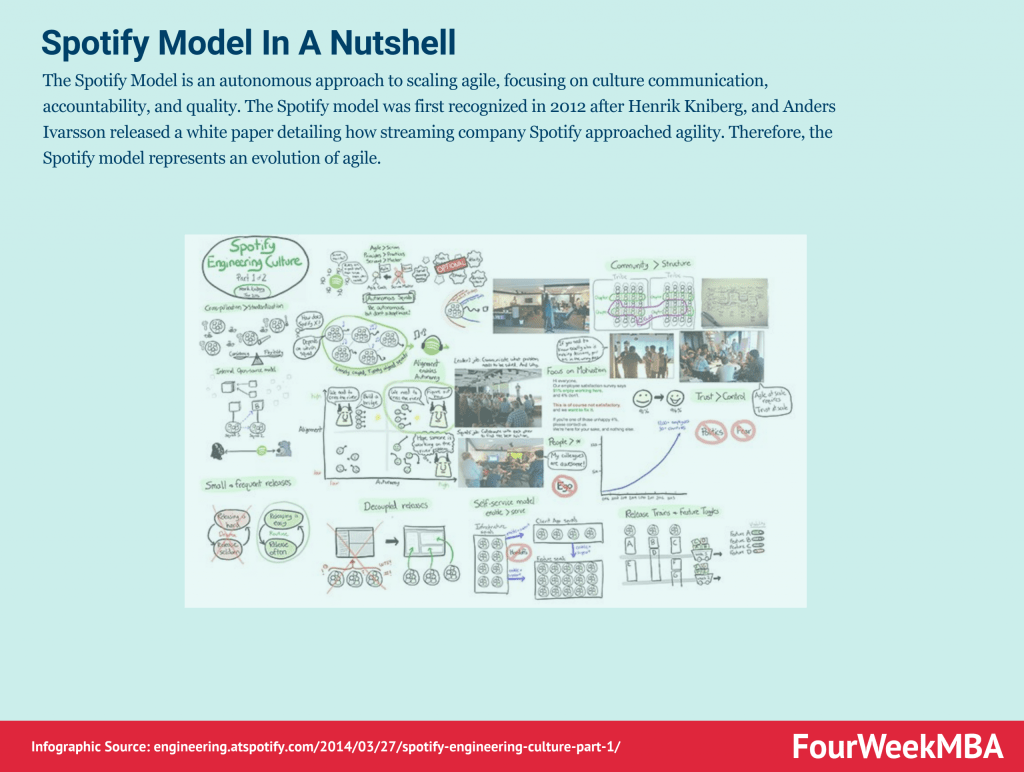
The Spotify Model is an autonomous approach to scaling agile, focusing on culture communication, accountability, and quality. The Spotify model was first recognized in 2012 after Henrik Kniberg, and Anders Ivarsson released a white paper detailing how streaming company Spotify approached agility. Therefore, the Spotify model represents an evolution of agile.
As the name suggests, TDD is a test-driven technique for delivering high-quality software rapidly and sustainably. It is an iterative approach based on the idea that a failing test should be written before any code for a feature or function is written. Test-Driven Development (TDD) is an approach to software development that relies on very short development cycles.
Timeboxing is a simple yet powerful time-management technique for improving productivity. Timeboxing describes the process of proactively scheduling a block of time to spend on a task in the future. It was first described by author James Martin in a book about agile software development.
Scrum is a methodology co-created by Ken Schwaber and Jeff Sutherland for effective team collaboration on complex products. Scrum was primarily thought for software development projects to deliver new software capability every 2-4 weeks. It is a sub-group of agile also used in project management to improve startups’ productivity.
Scrumban is a project management framework that is a hybrid of two popular agile methodologies: Scrum and Kanban. Scrumban is a popular approach to helping businesses focus on the right strategic tasks while simultaneously strengthening their processes.
Scrum anti-patterns describe any attractive, easy-to-implement solution that ultimately makes a problem worse. Therefore, these are the practice not to follow to prevent issues from emerging. Some classic examples of scrum anti-patterns comprise absent product owners, pre-assigned tickets (making individuals work in isolation), and discounting retrospectives (where review meetings are not useful to really make improvements).
Scrum at Scale (Scrum@Scale) is a framework that Scrum teams use to address complex problems and deliver high-value products. Scrum at Scale was created through a joint venture between the Scrum Alliance and Scrum Inc. The joint venture was overseen by Jeff Sutherland, a co-creator of Scrum and one of the principal authors of the Agile Manifesto.
Six Sigma is a data-driven approach and methodology for eliminating errors or defects in a product, service, or process. Six Sigma was developed by Motorola as a management approach based on quality fundamentals in the early 1980s. A decade later, it was popularized by General Electric who estimated that the methodology saved them $12 billion in the first five years of operation.
Stretch objectives describe any task an agile team plans to complete without expressly committing to do so. Teams incorporate stretch objectives during a Sprint or Program Increment (PI) as part of Scaled Agile. They are used when the agile team is unsure of its capacity to attain an objective. Therefore, stretch objectives are instead outcomes that, while extremely desirable, are not the difference between the success or failure of each sprint.
The Toyota Production System (TPS) is an early form of lean manufacturing created by auto-manufacturer Toyota. Created by the Toyota Motor Corporation in the 1940s and 50s, the Toyota Production System seeks to manufacture vehicles ordered by customers most quickly and efficiently possible.
The Total Quality Management (TQM) framework is a technique based on the premise that employees continuously work on their ability to provide value to customers. Importantly, the word “total” means that all employees are involved in the process – regardless of whether they work in development, production, or fulfillment.
The waterfall model was first described by Herbert D. Benington in 1956 during a presentation about the software used in radar imaging during the Cold War. Since there were no knowledge-based, creative software development strategies at the time, the waterfall method became standard practice. The waterfall model is a linear and sequential project management framework.
Gennaro is the creator of FourWeekMBA, which reached about four million business people, comprising C-level executives, investors, analysts, product managers, and aspiring digital entrepreneurs in 2022 alone | He is also Director of Sales for a high-tech scaleup in the AI Industry | In 2012, Gennaro earned an International MBA with emphasis on Corporate Finance and Business Strategy.
Scroll to Top
Discover more from FourWeekMBA
Subscribe now to keep reading and get access to the full archive.