A burndown chart is a graphical representation of outstanding work versus time and is useful for predicting when all of the work will be completed. A burndown chart can be created by estimating the required effort to complete a project and tracking daily task progress. For the duration of the project, the team must also determine its actual effort against the estimated effort and plot the dataset to evaluate progress. A burndown chart is simple to understand and provides clarity on project scope and progress. However, the accuracy of a burndown chart relies on estimations invariably influenced by cognitive biases. In poorly defined projects, the quality of the resultant chart will be similarly poor.
Successful project managers realize the importance of statistics and graphical illustration tools in facilitating communication and collaboration amongst team members.
One of the more popular tools is the burndown chart, favored because of its simplicity and effectiveness.
Broadly speaking, a burndown chart displays how much work remains to be completed on the y-axis with the number of days since work began on the x-axis.
By comparing its actual progress with an ideal rate of progress, the project team can determine whether it is on or behind schedule.
In agile software development methodologies such as Scrum, these charts graphically illustrate the speed with which a team is working by plotting user stories against time.
Scrum is a methodology co-created by Ken Schwaber and Jeff Sutherland for effective team collaboration on complex products. Scrum was primarily thought for software development projects to deliver new software capability every 2-4 weeks. It is a sub-group of agile also used in project management to improve startups’ productivity.
After the successful completion of a user story, the chart is updated.
The chart can also record the pace of a team – otherwise known as velocity – and predict its performance.
Creating a burndown chart
Though the burndown chart can be used in almost any context, it has seen renewed interest in agile software development.
With that in mind, we will now detail the steps required to complete a burndown chart:
Estimate effort
What is the ideal baseline for using the available hours throughout the sprint?
In most cases, this is determined by dividing the available hours by the number of days the sprint will run across.
For a sprint of 80 hours over 8 days, the effort required is 10 hours per day.
Team leaders must then quantify the burndown as a daily running total with 80 hours remaining on Day 0, 70 hours remaining on Day 1, 60 hours remaining on Day 2, and so forth.
Track daily progress
Daily progress is then captured in the table against each daily task.
Note that the hours assigned to each task are the estimated effort required for completion and not the actual effort.
Determine the actual effort
At the conclusion of each day, the total remaining effort must be calculated by subtracting the actual effort from the running total.
As the project progresses, the actual effort will fluctuate above and below the estimated effort.
These disparities depend on how accurately the initial project work was estimated and whether individuals can work effectively as a team.
Plot the final dataset
Using the data from step three, the burndown chart itself can be created by using a simple application such as Microsoft Excel.
Once plotted, the project team can compare planned and actual progress.
Benefits and limitations of burndown charts
Benefits
The most obvious benefit of a burndown chart is that it provides a clear and visible progress update to all members of the project team.
The chart is easy to understand, which increases employee motivation and buy-in.
Burndown charts also help the project team deal with small issues before they become large problems.
By tracking actual progress against ideal progress, the conversation is naturally steered toward the project and any obstacles to its timely completion.
Limitations
The effectiveness of the burndown chart as a project management tool relies on the accuracy of time estimates.
Unfortunately, these estimates are notoriously inaccurate because they are influenced by cognitive biases.
In a sprint, where story points deal with complexity and relative sizing, the problem isn’t as pronounced.
But the cognitive biases associated with estimation remain. If a team overestimates project time requirements, progress will appear on track or ahead of schedule.
Conversely, if a team underestimates time requirements, the chart will suggest they are behind schedule.
What’s more, the charts also show progress without providing clarity on whether the team is working on the right thing.
In poorly defined projects, burndown charts do not reflect how close the team is to completing the work.
This can lead to exaggerated or unrealistic expectations and team disunity.
Burndown Chart Vs. Burn Up Chart
Whereas in a Burndown Chart, you can track how much is left for the completion of a project, on the converse, in a burn-up chart, you can see the amount of work that has been put on that project’s task.
Thus the two tools combined can give you a much more complete understanding of the project’s completion and development.
Burndown Chart, Scrum, And Agile
Since Burndown charts are a way to track the progress of a project, that also fits nicely into Scrum.
Indeed, a Burndown chart enables teams to evaluate the efforts needed for specific tasks and track their completion as the project moves forward.
It’s critical that for a burndown chart to be effective in Scrum, it needs to fit into an agile mindset.
Agile started as a lightweight development method compared to heavyweight software development, which is the core paradigm of the previous decades of software development. By 2001 the Manifesto for Agile Software Development was born as a set of principles that defined the new paradigm for software development as a continuous iteration. This would also influence the way of doing business.
That is a process that requires a continuous feedback loop to develop a valuable product and build a viable businessmodel. Continuous innovation is a mindset where products and services are designed and delivered to tune them around the customers’ problem and not the technical solution of its founders.
Case Studies
Software Development:
Description: A software development team is working on a new application.
Application of Burndown Chart:
Estimate the effort required for each feature or user story.
Track daily progress by updating the chart with completed tasks.
Visualize the remaining work to ensure the project stays on schedule.
Outcome: The team can monitor the project’s progress, identify potential delays, and adjust their work to meet the deadline.
Project Management:
Description: A project manager is overseeing a construction project.
Application of Burndown Chart:
Estimate the tasks and resources required for each construction phase.
Update the chart daily with completed tasks or milestones.
Identify areas where the project is falling behind and take corrective actions.
Outcome: The project manager can ensure that construction stays on track, allocate resources efficiently, and meet project deadlines.
Product Development:
Description: A product development team is creating a new consumer gadget.
Application of Burndown Chart:
Break down the product development process into key stages.
Monitor daily progress in each stage and update the chart.
Ensure that the development timeline aligns with product launch goals.
Outcome: The team can visualize the development progress, identify bottlenecks, and adjust their workflow to meet product launch deadlines.
Marketing Campaign:
Description: A marketing team is running a campaign to launch a new product.
Application of Burndown Chart:
Estimate and plan the tasks required for the campaign, such as content creation, advertising, and social media promotion.
Update the chart daily with completed campaign activities.
Monitor the campaign’s progress and make real-time adjustments to meet launch goals.
Outcome: The marketing team can ensure that the campaign stays on schedule, track the completion of essential tasks, and optimize marketing strategies for better results.
Manufacturing:
Description: A manufacturing company is producing a new line of electronics.
Application of Burndown Chart:
Estimate the production tasks for each component of the electronics.
Daily updates on completed production tasks.
Monitor the production timeline to ensure on-time product delivery.
Outcome: The manufacturing team can track production progress, identify production delays, and ensure timely delivery of the electronics.
Customer Support:
Description: A customer support team is addressing a high volume of support tickets.
Application of Burndown Chart:
Estimate the effort required to resolve each support ticket.
Update the chart daily with resolved tickets.
Monitor the team’s progress in addressing customer issues.
Outcome: The customer support team can track their workload, prioritize tickets effectively, and ensure that customer issues are addressed in a timely manner.
Supply Chain Management:
Description: A logistics company is managing a complex supply chain operation.
Application of Burndown Chart:
Estimate the tasks required at each stage of the supply chain, such as procurement, transportation, and distribution.
Daily updates on completed tasks.
Monitor the progress of the supply chain operation to avoid delays and bottlenecks.
Outcome: The logistics team can optimize supply chain operations, identify potential disruptions, and ensure timely delivery of goods to customers.
Key Highlights
Definition of Burndown Chart: A burndown chart is a graphical representation of outstanding work versus time. It predicts when all work will be completed and is created by estimating effort and tracking daily progress.
Creating a Burndown Chart:
Estimate Effort: Determine the ideal effort for each day by dividing total available hours by the number of days in the sprint.
Track Daily Progress: Record daily progress against tasks, using estimated effort.
Determine Actual Effort: Calculate daily remaining effort by subtracting actual effort from the running total.
Plot the Chart: Create the burndown chart using a tool like Microsoft Excel, comparing planned vs. actual progress.
Benefits of Burndown Charts:
Provides clear visibility of progress to the project team.
Easy to understand, boosting motivation and engagement.
Helps identify and address issues before they become major problems.
Limitations of Burndown Charts:
Relies on accurate time estimates, which can be influenced by cognitive biases.
Inaccurate estimates can lead to misleading progress indications.
Doesn’t provide insight into whether the team is working on the right tasks.
In poorly defined projects, may lead to unrealistic expectations and team discord.
Burndown Chart vs. Burn Up Chart:
Burndown Chart tracks remaining work over time.
Burn Up Chart displays completed work over time.
Using both charts together provides a comprehensive view of project completion and development.
Burndown Charts in Scrum and Agile:
Burndown charts align well with Scrum methodology.
They enable task evaluation and tracking during the project.
Effective burndown charts fit into the agile mindset, emphasizing continuous feedback and iteration.
Agile methodology focuses on customer-centric problem-solving and continuous innovation.
AIOps is the application of artificial intelligence to IT operations. It has become particularly useful for modern IT management in hybridized, distributed, and dynamic environments. AIOps has become a key operational component of modern digital-based organizations, built around software and algorithms.
Agile started as a lightweight development method compared to heavyweight software development, which is the core paradigm of the previous decades of software development. By 2001 the Manifesto for Agile Software Development was born as a set of principles that defined the new paradigm for software development as a continuous iteration. This would also influence the way of doing business.
Agile project management (APM) is a strategy that breaks large projects into smaller, more manageable tasks. In the APM methodology, each project is completed in small sections – often referred to as iterations. Each iteration is completed according to its project life cycle, beginning with the initial design and progressing to testing and then quality assurance.
Agile Modeling (AM) is a methodology for modeling and documenting software-based systems. Agile Modeling is critical to the rapid and continuous delivery of software. It is a collection of values, principles, and practices that guide effective, lightweight software modeling.
Agile Business Analysis (AgileBA) is certification in the form of guidance and training for business analysts seeking to work in agile environments. To support this shift, AgileBA also helps the business analyst relate Agile projects to a wider organizational mission or strategy. To ensure that analysts have the necessary skills and expertise, AgileBA certification was developed.
Business modelinnovation is about increasing the success of an organization with existing products and technologies by crafting a compelling value proposition able to propel a new business model to scale up customers and create a lasting competitive advantage. And it all starts by mastering the key customers.
That is a process that requires a continuous feedback loop to develop a valuable product and build a viable businessmodel. Continuous innovation is a mindset where products and services are designed and delivered to tune them around the customers’ problem and not the technical solution of its founders.
A design sprint is a proven five-day process where critical business questions are answered through speedy design and prototyping, focusing on the end-user. A design sprint starts with a weekly challenge that should finish with a prototype, test at the end, and therefore a lesson learned to be iterated.
Tim Brown, Executive Chair of IDEO, defined design thinking as “a human-centered approach to innovation that draws from the designer’s toolkit to integrate the needs of people, the possibilities of technology, and the requirements for business success.” Therefore, desirability, feasibility, and viability are balanced to solve critical problems.
DevOps refers to a series of practices performed to perform automated software development processes. It is a conjugation of the term “development” and “operations” to emphasize how functions integrate across IT teams. DevOps strategies promote seamless building, testing, and deployment of products. It aims to bridge a gap between development and operations teams to streamline the development altogether.
Product discovery is a critical part of agile methodologies, as its aim is to ensure that products customers love are built. Product discovery involves learning through a raft of methods, including design thinking, lean start-up, and A/B testing to name a few. Dual Track Agile is an agile methodology containing two separate tracks: the “discovery” track and the “delivery” track.
Feature-Driven Development is a pragmatic software process that is client and architecture-centric. Feature-Driven Development (FDD) is an agile software development model that organizes workflow according to which features need to be developed next.
eXtreme Programming was developed in the late 1990s by Ken Beck, Ron Jeffries, and Ward Cunningham. During this time, the trio was working on the Chrysler Comprehensive Compensation System (C3) to help manage the company payroll system. eXtreme Programming (XP) is a software development methodology. It is designed to improve software quality and the ability of software to adapt to changing customer needs.
The Agile methodology has been primarily thought of for software development (and other business disciplines have also adopted it). Lean thinking is a process improvement technique where teams prioritize the value streams to improve it continuously. Both methodologies look at the customer as the key driver to improvement and waste reduction. Both methodologies look at improvement as something continuous.
A startup company is a high-tech business that tries to build a scalable business model in tech-driven industries. A startup company usually follows a lean methodology, where continuous innovation, driven by built-in viral loops is the rule. Thus, driving growth and building network effects as a consequence of this strategy.
Kanban is a lean manufacturing framework first developed by Toyota in the late 1940s. The Kanban framework is a means of visualizing work as it moves through identifying potential bottlenecks. It does that through a process called just-in-time (JIT) manufacturing to optimize engineering processes, speed up manufacturing products, and improve the go-to-market strategy.
RAD was first introduced by author and consultant James Martin in 1991. Martin recognized and then took advantage of the endless malleability of software in designing development models. Rapid Application Development (RAD) is a methodology focusing on delivering rapidly through continuous feedback and frequent iterations.
Scaled Agile Lean Development (ScALeD) helps businesses discover a balanced approach to agile transition and scaling questions. The ScALed approach helps businesses successfully respond to change. Inspired by a combination of lean and agile values, ScALed is practitioner-based and can be completed through various agile frameworks and practices.
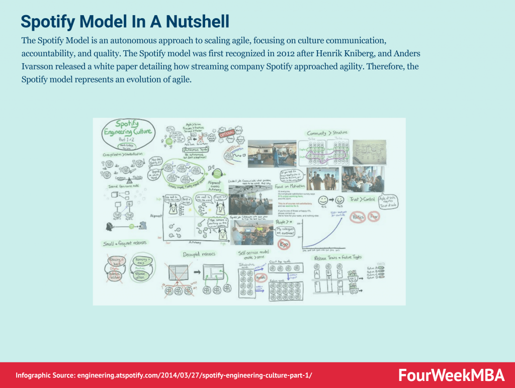
The Spotify Model is an autonomous approach to scaling agile, focusing on culture communication, accountability, and quality. The Spotify model was first recognized in 2012 after Henrik Kniberg, and Anders Ivarsson released a white paper detailing how streaming company Spotify approached agility. Therefore, the Spotify model represents an evolution of agile.
As the name suggests, TDD is a test-driven technique for delivering high-quality software rapidly and sustainably. It is an iterative approach based on the idea that a failing test should be written before any code for a feature or function is written. Test-Driven Development (TDD) is an approach to software development that relies on very short development cycles.
Timeboxing is a simple yet powerful time-management technique for improving productivity. Timeboxing describes the process of proactively scheduling a block of time to spend on a task in the future. It was first described by author James Martin in a book about agile software development.
Scrum is a methodology co-created by Ken Schwaber and Jeff Sutherland for effective team collaboration on complex products. Scrum was primarily thought for software development projects to deliver new software capability every 2-4 weeks. It is a sub-group of agile also used in project management to improve startups’ productivity.
Scrum anti-patterns describe any attractive, easy-to-implement solution that ultimately makes a problem worse. Therefore, these are the practice not to follow to prevent issues from emerging. Some classic examples of scrum anti-patterns comprise absent product owners, pre-assigned tickets (making individuals work in isolation), and discounting retrospectives (where review meetings are not useful to really make improvements).
Scrum at Scale (Scrum@Scale) is a framework that Scrum teams use to address complex problems and deliver high-value products. Scrum at Scale was created through a joint venture between the Scrum Alliance and Scrum Inc. The joint venture was overseen by Jeff Sutherland, a co-creator of Scrum and one of the principal authors of the Agile Manifesto.
Gennaro is the creator of FourWeekMBA, which reached about four million business people, comprising C-level executives, investors, analysts, product managers, and aspiring digital entrepreneurs in 2022 alone | He is also Director of Sales for a high-tech scaleup in the AI Industry | In 2012, Gennaro earned an International MBA with emphasis on Corporate Finance and Business Strategy.
Scroll to Top
Discover more from FourWeekMBA
Subscribe now to keep reading and get access to the full archive.